Get
noticed
We’re all just a bunch of fish in a pond.
Design 5 Studio focuses on making your brand stand out. Personal branding, product branding or getting your business noticed is our number one goal when creating a presence.
What
We Do
Brand Identity
Distinctive visual elements that capture the essence of your brand.
MARKETING DESIGN
Visual assets used to promote a product, service, or brand across various channels.
Packaging Design
Visual and structural design of a product packaging to make it functional, visually appealing, and aligned with the brand identity.
Art Direction
Guiding visual style and creative vision of a project to ensure it aligns with the intended message and brand identity.
Campaign Design
Strategic planning and creation of visual and messaging elements.
Custom Typography
Designing bespoke typefaces and lettering for unique brand expressions.
Our
Process
Discovery
Deep dive into your brand, market, and objectives through collaborative workshops and research.
Strategy
Develop a comprehensive creative strategy aligned with your business goals and target audience.
Concept
Create innovative design concepts that push boundaries while maintaining brand coherence.
Design
Transform concepts into polished designs through iterative refinement and attention to detail.
Production
Execute final designs across all required formats and mediums with precision.
Launch
Support the launch with comprehensive guidelines and implementation assistance.
Our
Work

Armaments Manufacturer
Brand Identity
Symbol, Typography, Color Therapy, and Usage Details
Color System
Red and Black evoke strong emotions and convey messages of power
Typography
Brand name font used for a simple clean style but still bold enough to provide matched styling to the brand.
Digital Assets
Logos in black, white, and red. Also created mockups for merch, business cards, and boxes

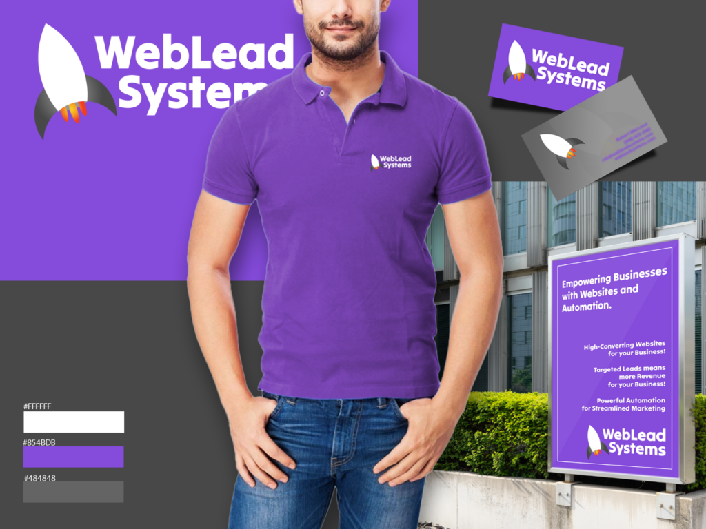
SEO, Website, & Automation Experts
Brand Identity
Symbol, Typography,and Usage Details The rocket symbol was created to portray the concept of upward growth for their businesses
Typography
Font used was to give a clean and simplistic style as to not over power the symbol and to add weight to the full logo.
Digital Assets
Logo design and Font for use on other materials and on the website Also mockups for merch, business cards, and a poster design for outdoor kiosk advertising.

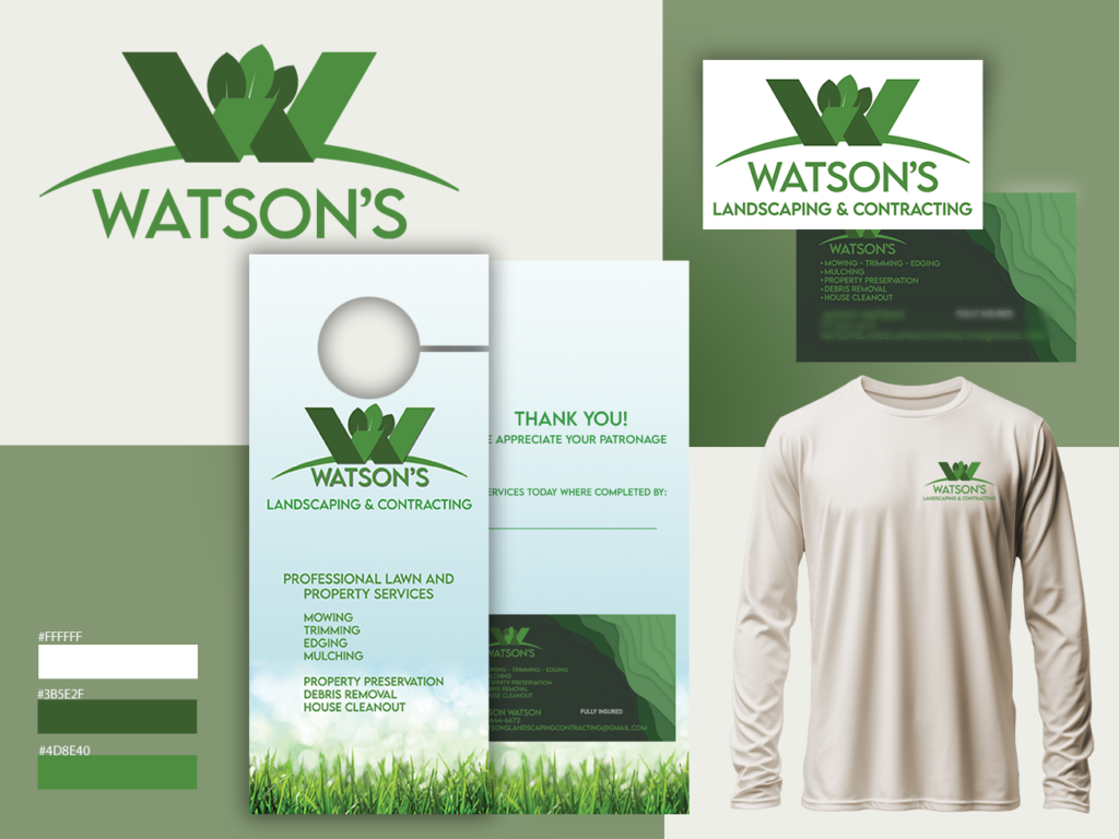
LANDSCAPING SERVICES
Brand Identity
Using a monogram W and adding a swoop under it to signify a hill plus leaves on top to signify nature/plants/trees
Typography
We use clean simplistic fonts. As a service based company we wanted to avoid a fancy/stylized font to keep things “commercial”.
Digital Assets
Logo design and Font for use on other materials and on the website. Mockups for business cards, merch, and a 2 sided door hanger with a tear off business card.
Our
Studio

Book a meeting with us
What
They Say
About Us


deliver real
business impact
Fairfax, Virginia
Let's Create Something Extraordinary Together

© 2025 Design Five Studio. All rights reserved.